

DESCRIPTION
Design a sample web page layout using a grid for a new company web site.
PROCESS (Programs, Tools, Skills, FOCUS principles)
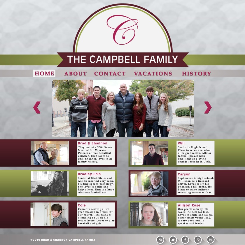
1. I first decided to do a mock webpage layout using my family as an example. We had pictures made last December so I knew I could use those for this web page mockup layout.
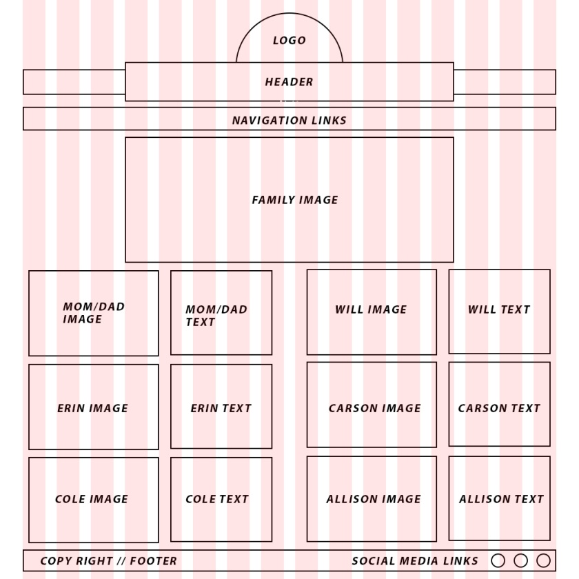
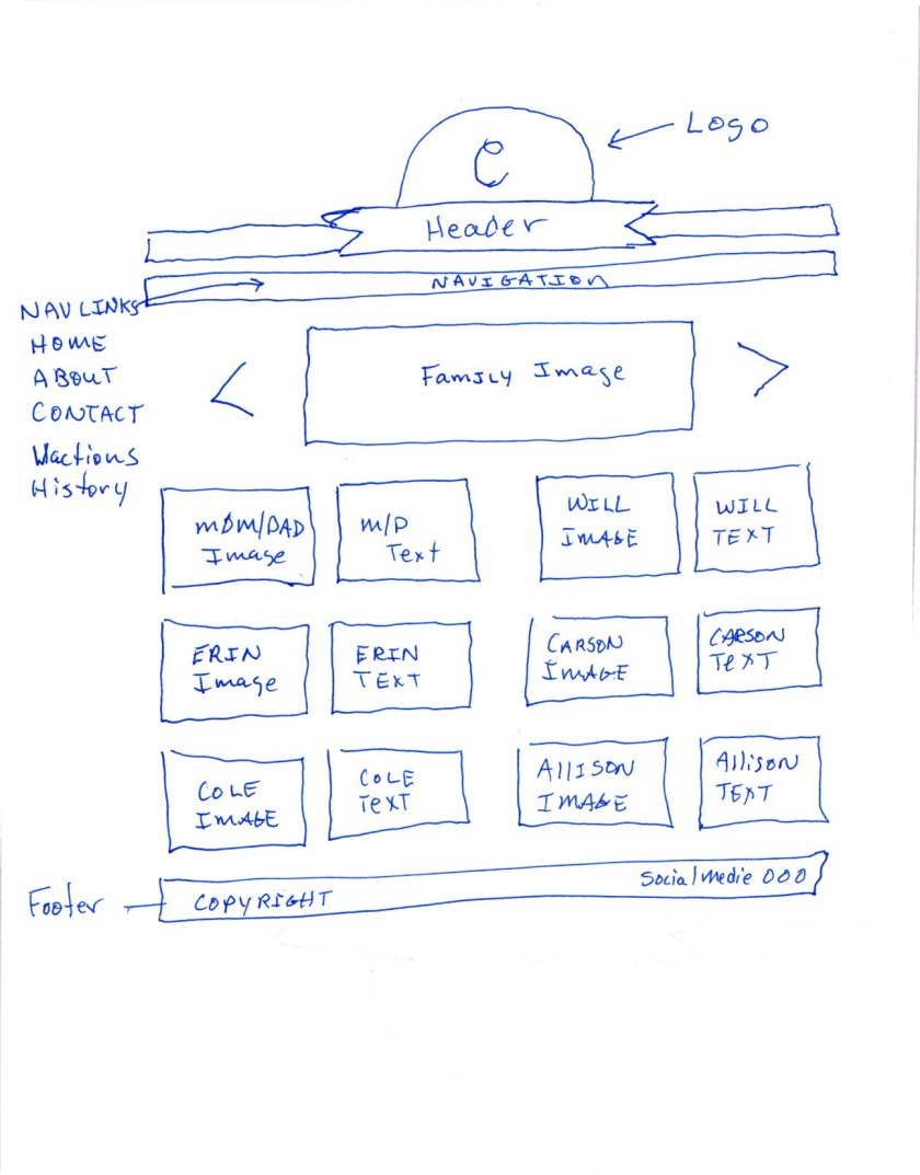
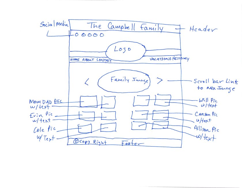
2. I began the sketching process to decide how I wanted to layout my elements on the 16-column grid. I did about five sketches of the page so I would have a good understanding of how each of the elements could come together on the page.
3. Next I began designing a logo in Adobe Illustrator for my families web page. I basically used shapes and a scripted letter C for the design of the logo. I saved the file as .png and placed it into the grid template in Photoshop.
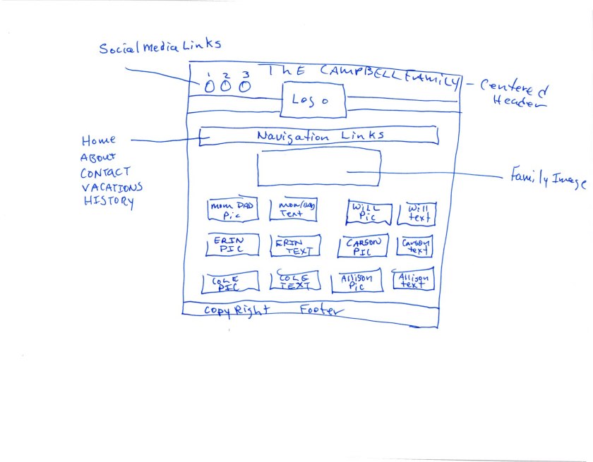
4. I began building the wire frame on the 16-column grid that was supplied. I made solid filled squares for images, a half-circle for my logo, rectangles for the header and footer. I labeled each square for an image, and each other element of the web page. The other elements were: logo, header, footer, text box, social media links, navigation links, copyright on the footer.
5. I began reformatting the family images that I chose to use in the web page mockup so the files size would be adequate for a web page.
6. I placed each image into the wire frame by going to file, Place linked, browse to image in web page layout folder, selecting enter, going to the image file layer and creating a clipping mask. Next, I scaled the image to the appropriate size and then positioned the image as needed.
7. Continuing, I entered every element that was required for the web page layout adding a few background elements to help add to the design and create movement movement in the page, added texture, displayed overlapping and created a focal point with the family image. I inserted the necessary text into the text boxes for each family members image and then described the individual to the audience.
8. Lastly, I saved the file as an Adobe Photoshop .psd and .jpg as the client requested. I also made sure that I had a wireframe .jpg on a 960 grid to go along in a .zip file to the client.
CRITIQUE PROCESS
I met with my daughter Erin Campbell via Skype last night. She is a Speech Pathology major at Utah State University. We discussed the color scheme and arrangement of the images. She suggested that I add more text to each text box. Also she suggested using a shade lighter background color so the page wouldn’t be so dark. She liked my font choices and liked the alignment of the page.
I also received a Facebook critique from Chearsten Webb yesterday and Skyler Foxx today. Chearsten suggested to check the centering of the C, in the logo. She also suggested removing the drop shadow off of the copyright in the footer. She suggested spacing out the navigation links a bit and to possibly add some social media links to the page. Skyler suggested the same, remove the drop shadow off of the copyright in the footer. He liked everything else about the web page mockup.
MESSAGE
Introduce Brad & Shannon Campbell’s family on the web to their friends and family by offering pictures, contact information, vacation trips, and the latest news and information on each of the children.
AUDIENCE
Brad and Shannon Campbell’s friends and family that want to learn more about each member of the family.
TOP THING LEARNED
How to use a 960 Column Grid System to layout a web page.
COLOR SCHEME & COLOR NAMES
Complementary // Dark Red, Magenta and Olive Green.
TITLE FONT NAME & CATEGORY
Antigone // Sans Serif- Grotesque
COPY FONT NAME & CATEGORY
Palatino // Serif – Old Style
THUMBNAILS OF ANY ORIGINAL, UNEDITED IMAGE(S) USED IN THE PROJECT


SOURCE OF EACH IMAGE (website name and hyperlink)
Logo is my own. All other images belong to my family.

I really enjoyed looking at your project. I liked how you did a website mock up about your family. It is neat to see your family pictures and learn more about your family. You have such a beautiful family. I like the maroon and green colors. They work well with the pictures. I like the repetition of the colored boxes. Your alignment is so good. Great job on your design.
LikeLike
My blog: https://juliebaughmanblog.wordpress.com/
Classmate’s blog: https://heatherhholt.wordpress.com/category/design-comm-130/
LikeLike
I love the social media you added to the bottom really just finishes the piece off. They are so elegant as well. The whole thing is great color, layout, content. Check out https://duncanmiranda.wordpress.com/2016/11/17/10a-website-mockup/comment-page-1/#comment-31 project too!
LikeLike